
Key Takeaways
- Optimise for Mobile: Over 70% of YouTube viewership happens on mobile devices. If your thumbnail cannot be read when scaled down to the size of a postage stamp, it will fail.
- Leverage the Knowledge Gap: Use your visuals to pose a question that can only be answered by clicking the video.
- Embrace Built-in Testing: Stop guessing. Utilise YouTube's native A/B testing ("Test & Compare") to let the algorithm mathematically determine your highest-converting image.
At SEOWebster, we regularly see client videos with incredible retention rates stall out at 500 views simply because their thumbnail CTR is hovering below 3%. Your thumbnail is your visual meta description - it is the barrier to entry between your audience and your hard work. When we updated the thumbnails across our managed channels using the high-contrast rules below, we saw an average CTR jump from 4.2% to 7.8% within two weeks.
With millions of videos uploaded daily, standard screenshots and generic stock images easily get lost in the feed. Most creators struggle with low click-through rates (CTR) despite producing incredibly high-quality video content. The reality is that the modern YouTube landscape requires treating your visual packaging with as much respect as the video itself.
This guide strips away the guesswork. We will break down the exact technical specs, psychological triggers, and design principles used by top creators in 2026. By the end of this article, you will know exactly how to design mobile-optimised thumbnails, write compelling hook text, and use data-driven A/B testing to guarantee higher views.
Why Your YouTube Thumbnail is Your Most Important SEO Asset
A good YouTube thumbnail uses high-contrast colours, an expressive human face, and minimal text (under 5 words). It should accurately represent the video content, create curiosity, and be easily readable on small mobile screens.
To understand why thumbnails matter, you must look at YouTube as a search engine. In standard SEO, your meta title and description determine whether someone clicks your link in the search results. On YouTube (the world’s second-largest search engine), your thumbnail acts as your visual meta description.
The mathematics of YouTube success relies on a simple formula: Impressions × CTR = Views.
Imagine your video receives 100,000 impressions on the YouTube homepage.
- With a weak thumbnail yielding a 2% CTR, you earn 2,000 views.
- With an optimised, high-performing thumbnail yielding an 8% CTR, you secure 8,000 views.
That difference compounds exponentially. YouTube’s recommendation algorithm heavily weights CTR and Average View Duration (AVD). High-CTR videos are pushed to broader audiences, snowballing your viewership.
Furthermore, engaging thumbnails are a crucial asset for off-platform SEO. When you embed your videos on your website - a key tactic in Video SEO - a compelling thumbnail encourages visitors to click and watch, vastly increasing their time-on-page. This is a massive behavioural signal that aids in overarching backlink building SEO strategies and domain authority growth.
Technical Requirements for YouTube Thumbnails in 2026
Before diving into advanced design psychology, you must master the fundamental technical constraints.
The optimal YouTube thumbnail size is 1280 pixels by 720 pixels, with a minimum width of 640 pixels. It must have a 16:9 aspect ratio, be saved as a JPG, PNG, or GIF, and have a file size of under 2MB.
To ensure flawless delivery across 4K televisions and small smartphones alike, adhere to these strict specifications:
- Resolution: 1280 x 720 pixels (HD).
- Aspect Ratio: 16:9.
- File Size Constraint: Strictly under 2MB.
- Accepted Formats: JPG, PNG, GIF (non-animated).
The YouTube UI Safe Zone
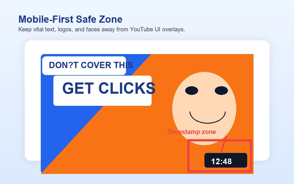
Many beginner designers make the critical mistake of treating the thumbnail canvas as an empty 1280x720 rectangle. It isn’t. YouTube superimposes native UI elements directly over your image.
The biggest culprit is the video timestamp, which sits permanently in the bottom right corner. Never place crucial text, logos, or the focal point of a face in the bottom right quadrant. Similarly, leave a slight margin at the top right to account for “Watch Later” and playlist overlay icons.
To map these safe zones precisely against a real-world example, pull a reference image from a top-ranking video using our free YouTube thumbnail downloader, then overlay the YouTube UI elements in your design tool. Designing around an actual extracted thumbnail is far more accurate than working from memory.
10 Proven YouTube Thumbnail Design Tips
Below are 10 YouTube thumbnail design tips to instantly elevate your visual packaging and rapidly boost your CTR.
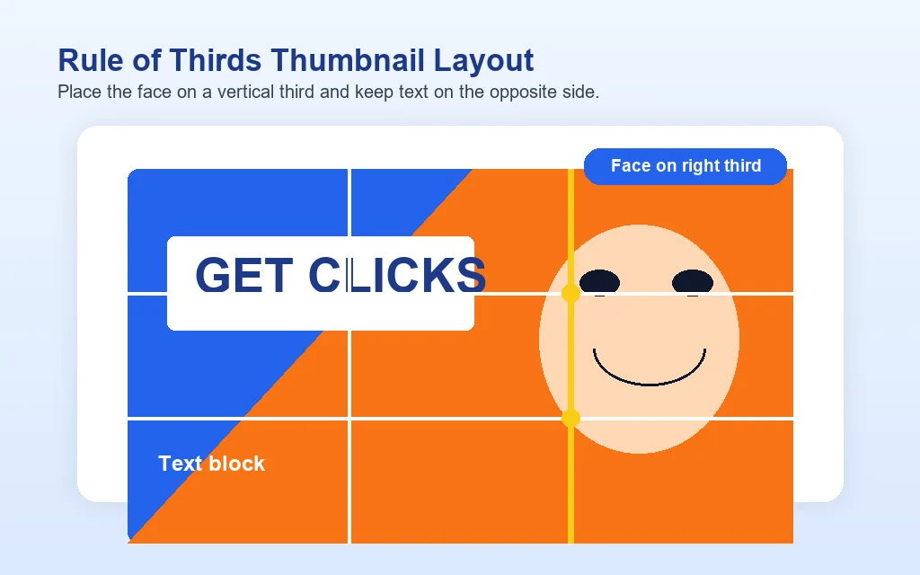
1. Follow the Rule of Thirds for Composition
The human eye naturally gravitates toward intersections on a grid rather than the dead centre of an image. Divide your 1280x720 thumbnail into a 3x3 grid. Place your primary subject (usually a face) on either the left or right vertical third. Place your text block on the opposite third. This creates a balanced, professional composition that intuitively guides the viewer’s eye from the text to the visual hook.
2. Master High-Contrast Colour Theory
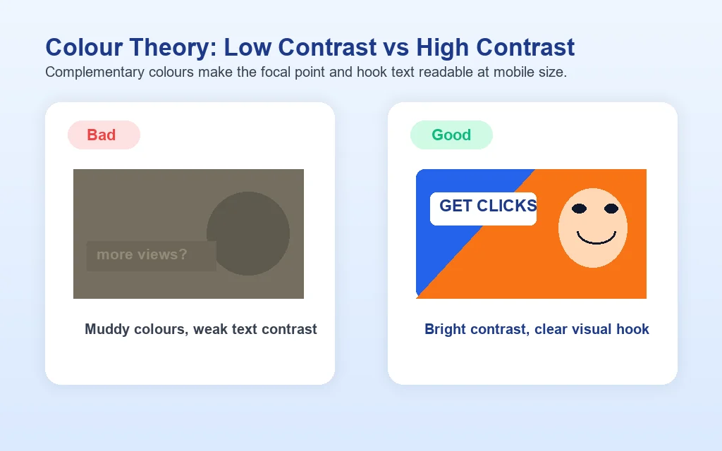
Your thumbnail is competing against a sea of content in YouTube’s light or dark mode UI. To stand out, you must use contrasting colours.
If your background is dark or cool (blues, purples), your focal elements and text should be bright and warm (yellows, oranges, bright greens). Using a colour wheel to find complementary colours (e.g., blue and orange, red and green) ensures your thumbnail “pops” without appearing muddy. A classic technique is to apply a subtle, dark vignette around the edges of the image to force the viewer’s eyes directly toward the brightly coloured centre.
3. Use Expressive Faces and Eye Contact
Humans are biologically hardwired to recognise and decode facial expressions. An expressive face conveys the emotional payoff of the video in a fraction of a second.
- Eye Contact: Looking directly into the camera lens establishes aggressive, engaging eye contact with the viewer scrolling past.
- Exaggerated Emotions: Shock, confusion, extreme joy, or frustration work better than a standard smile. Ensure the emotion perfectly aligns with the title of the video.
4. Apply the SEOWebster 3-Second Glance Test
Your thumbnail is not a manuscript. Countless creators ruin great visuals by pasting their entire 15-word title onto the image.
Aim for three to five words maximum. If a viewer cannot read and process your thumbnail text within a three-second glance, you fail the test. The text should strictly act as a tease or a complement to your actual video title. Use thick, bold, sans-serif fonts (like Impact, Anton, or Montserrat Bold). They remain highly legible when scaled down.
5. Design for the “Mobile-First” Safe Zones
Up to 70% of a channel’s traffic originates from mobile devices. If your thumbnail looks fantastic on an iMac but becomes a blur of unreadable pixels on an iPhone screen, it will fail. Pro Tip: Zoom completely out of your canvas in Photoshop or Canva until the image is the size of a postage stamp. If you cannot instantly read the text and identify the emotion, redesign it.
6. Maintain Brand Consistency Without Being Boring
Long-term channel growth relies on recognition. When a subscriber scrolls their homepage, they should identify your video before they even read the channel name. Achieve this by maintaining a consistent visual language: using the same two fonts, consistent colour grading or borders, or a specific layout format. If you need inspiration or want to research what works, use our free SEOWebster YouTube Thumbnail Downloader to extract competitor thumbnails for a mood board or competitive analysis. However, avoid creating templates that are too rigid, or your audience will suffer from “thumbnail blindness,” assuming they have already seen the video.
7. Create Curiosity (The “Knowledge Gap” Technique)
The highest CTR thumbnails do not give away the ending; they open a psychological “knowledge gap.” They present a scenario, a comparison, or a dramatic visual that begs a question in the viewer’s mind. A side-by-side comparison (“Before” vs. “After”), an obscured object, or text that contradicts a common belief (e.g., text saying “DON’T do this”) forces the user to click to resolve the tension.
8. Use AI Image Generators for Unique Backgrounds
We are transitioning into an era where generic stock imagery diminishes authority. To stand out, modern creators are leveraging generative AI platforms.
Using AI tools like Midjourney or DALL-E, you can generate hyper-specific, stylised, 3D-rendered backgrounds or elements that would be impossible to photograph. For example, instead of a standard office background, try a Midjourney prompt like: “Cinematic neon-lit podcast studio background, dark teal and orange colour grading, blurred depth of field, 8k resolution, photoreal —ar 16:9”. This immediately elevates the perceived production value of your video over competitors using flat or boring backdrops.
9. Boost Saturation and Vibrancy (Carefully)
Thumbnails require an aggressive approach to colour grading. Boost the contrast, saturation, and vibrancy of your images slightly higher than you would for standard photography. You want the whites to be bright and the colours to be vivid. Just be careful not to push saturation so high that human skin tones look radioactive or deep-fried.
10. Ensure the Thumbnail Matches the Video Hook
This is paramount for viewer retention. If your thumbnail promises an explosion but the first 30 seconds of your video is a prolonged, seated introduction, viewers will immediately click away. Clickbait works for getting the click, but it destroys your Average View Duration. The aesthetic, tone, and promise of your thumbnail must be immediately addressed and validated in the opening visual hook of the content.
Best Tools for Designing YouTube Thumbnails
You don’t need a degree in graphic design to create high-converting thumbnails. The right tools streamline the process:
- Canva: Perfect for beginners and advanced marketers alike. Canva’s background remover tool, vast font library, and high-contrast styling tools make pumping out high-quality thumbnails exceptionally fast.
- Adobe Photoshop: The industry standard for top-tier creators. Photoshop offers unparalleled control over masking, colour grading, and compositional tweaking.
- Generative AI: Incorporate Midjourney or Gemini to build bespoke background assets, textures, and vector graphics that give your thumbnails a unique, big-budget feel.
- Our free YouTube Thumbnail Analyzer: before you publish, run your design through our analyzer. It checks contrast, text readability at small sizes, and composition against the practices in this guide, and it takes seconds.
How to Study Competitor Thumbnails
Before designing, look at what already wins in your niche. A practical workflow:
- Search your target keyword on YouTube and note the top 10 thumbnails. Which colours dominate? How many use faces? How much text?
- To examine a thumbnail closely, open the video page and view the thumbnail at full resolution (YouTube serves it at a predictable image URL for every video), or simply screenshot it for your swipe file. Use competitor thumbnails for study only: never re-upload someone else’s artwork, which is a copyright violation and an instant credibility killer.
- Build a small swipe file of the 10 best examples in your niche and review it before each new design. Patterns you see three or more times are conventions your viewers already understand; break them deliberately, not accidentally.
- Run both your design and the strongest competitor thumbnail through our Thumbnail Analyzer and compare the scores side by side.
How to A/B Test Your YouTube Thumbnails
In the pursuit of maximum CTR, guessing is a luxury you cannot afford. YouTube has rolled out a native A/B testing feature that takes the subjective bias out of design. Here is how to use it:
- Access YouTube Studio: Navigate to the content tab and hover over the video you wish to edit.
- Select Test & Compare: In the thumbnail section, click on the three dots and select the “Test & Compare” tool.
- Upload Variations: Upload up to three distinct thumbnail designs. Crucial advice: Do not just test minor font colour changes. Test entirely different visual concepts (e.g., a text-heavy design vs. an expressive face design).
- Let the Engine Run: YouTube will dynamically serve the different options to audiences in real-time.
- Review the Data: Once statistical significance is reached, YouTube will automatically apply the “Winning” thumbnail based on total watch time share.
This methodology aligns directly with Answer Engine Optimisation (AEO) by ensuring you are feeding data-driven, heavily vetted visual answers to complex algorithmic systems.
Conclusion: Your Thumbnail Action Plan
Your YouTube thumbnail represents the barrier to entry between your audience and your hard work. By treating thumbnail design as a scientific, data-backed discipline rather than an artistic afterthought, you can dramatically shift your channel’s trajectory.
Implement the 1280x720 specs, guard your safe zones, leverage high-contrast psychology, and embrace the power of A/B testing.
If you need source thumbnails to study before you start designing, pull them in seconds with our free YouTube thumbnail downloader. It is the fastest way to build a swipe file of high-CTR examples from your niche.
Ready to scale your digital presence? Check out SEOWebster’s extensive Industry SEO strategies, or contact us to overhaul your digital marketing framework.
Frequently Asked Questions (FAQs)
What is the best YouTube thumbnail size for 2026? +-
How many words should be on a YouTube thumbnail? +-
What fonts are best for YouTube thumbnails? +-
Do YouTube thumbnails need a face? +-
How do I test which YouTube thumbnail is better? +-
Why does my thumbnail look blurry on YouTube? +-
What is the thumbnail safe zone? +-
Have questions about this article?
Ask the AI assistant anything — it has context on everything you just read.
AI Assistant
Ask about this article
I can summarize this article, explain concepts, and suggest related posts on SEOwebster.com.
Try asking